
Brand Essence

-
Brand
Core Values -
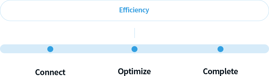
Brand Core Values are a concise expression of the identity the brand strives to embody and serve as the foundation of all brand activities. The core values of 3JCNS • 3JENG have been developed around functional and emotional benefits that differentiate the brand, forming the basis of its brand identity system. As the central concept guiding all brand activities, these values encapsulate the brand’s purpose, unique strengths, and competitive advantages. They are applied consistently across both verbal and visual communications to ensure a clear and unified brand message.
-
The Role and
Power of Efficiency -
- The power to simplify complexity.
- Enabling precise automation through data-driven technology.
- Connecting design, procurement, and construction into one seamless process.
- Speed built on accuracy.
Brand Color
-
Color
Guidelines -
For Websites & Mobile Applications (Web-Safe Colors)
-
HEX #110252
RGB 17, 2, 82Professionalism · Advanced Technology
Main Color -
HEX #e7f6fd
RGB 231, 246, 253Transparency · Trustworthiness
Sub Color -
HEX #f26522
RGB 242, 101, 34Creativity · Dynamism
Point Color
-
-
Color Usage
Guidelines -
The accurate application of brand colors plays a critical role in communicating the brand image consistently and effectively. Colors must be used according to the established guidelines. Inappropriate color combinations or unauthorized color variations may weaken brand recognition and compromise the intended visual identity. Particular care should be taken to maintain the clarity, visibility, and integrity of the wordmark. Colors that reduce the legibility or visual impact of the wordmark must not be used under any circumstances.
Primary
1 COLOR
2 COLOR



-
Prohibited
Usage Guidelines -
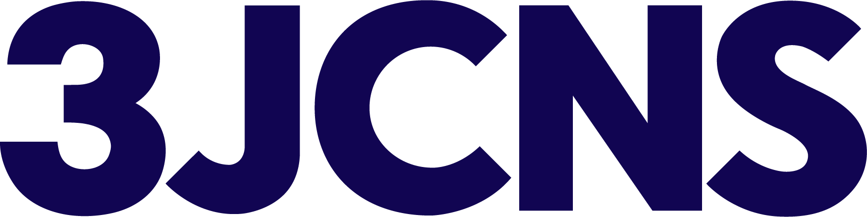
The correct use of the wordmark is essential for maintaining a consistent and professional brand image.
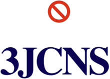
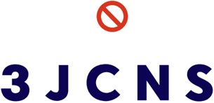
The wordmark must always be reproduced in its approved form. Altering its proportions, scaling it disproportionately, or modifying its appearance can significantly damage brand consistency and recognition.
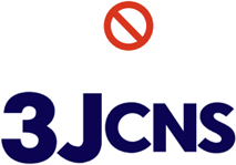
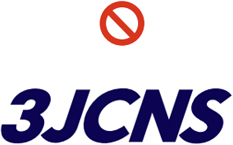
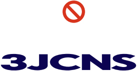
The following examples illustrate incorrect applications of the wordmark and must be avoided:-
1
Distorting the overall size or shape of the wordmark.
-
2
Applying tilt or rotation effects.
-
3
Altering horizontal or vertical proportions.
-
4
Replacing the approved typeface with another font.
-
5
Modifying letter spacing or character positioning.
-
1
Typefaces
-
Typography
Usage Standards -
Official typefaces are provided for both Korean and English applications and should be used across all brand communications, including brochures, corporate publications, print advertisements, websites, and other branded materials.
Approved English Typeface & Numerals
The designated typeface for English text and numerals is the Myriad Pro Family.
To reinforce the brand’s core value of Efficiency while conveying professionalism and sophistication, English typography should closely align with the approved typeface.
Alternative typefaces:
• Noto Sans
• Helvetica
• Univers-
Use Font
Myriad Pro Family -
Aa
- Myriad Pro Light
ABCDEFGHIJKLMNOPQRSTUVWXYZ
abcdefghijklmnopqrstuvwxyz 1234567890 - Myriad Pro Regular
ABCDEFGHIJKLMNOPQRSTUVWXYZ
abcdefghijklmnopqrstuvwxyz 1234567890 - Myriad Pro Semibold
ABCDEFGHIJKLMNOPQRSTUVWXYZ
abcdefghijklmnopqrstuvwxyz 1234567890 - Myriad Pro Bold
ABCDEFGHIJKLMNOPQRSTUVWXYZ
abcdefghijklmnopqrstuvwxyz 1234567890 - Myriad Pro Heavy
ABCDEFGHIJKLMNOPQRSTUVWXYZ
abcdefghijklmnopqrstuvwxyz 1234567890 - Myriad Pro Black
ABCDEFGHIJKLMNOPQRSTUVWXYZ
abcdefghijklmnopqrstuvwxyz 1234567890
- Myriad Pro Light
-